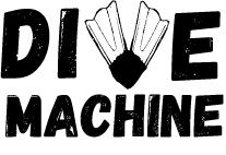
DIVE MACHINE REBAND - Workshop
- Megan Pearce Wright

- May 6, 2017
- 1 min read
AS part of our workshops for our campaign development we had to redesign a logo, it could either be for the Barbican or a brand of our choice. I chose dive machine because there logo is very basic and is a small d=scuba diving equipment shop in maidstone. I wanted to revamp it to represent what the company does. Sell dive equipment and provides scuba courses - bubble maker, PADI open water etc. I researched other dive brand logos and found that they mainly consisted of fish and other sea life animals. I decided to explore both the animals and products for the iconography of the brand.
Old logo:

RE-branding:
initial ideas

I experimented with sketches and illustrator concepts. I liked the visuals however i felt they looked 'too clean' I wanted a more sketched characteristic to the logo to make it look rustic. The company have been around a long time so wanted this to be present within the logo. I experimented with hand drawn elements as well as typography
progressed idea:

Experimentation of Logo:
Final Logo:

Overall I think my design works well because it has the rustic feel of a stamp which is used at the end of every dive to complete the dive and to log it. It includes the product element and its direct. Making it a successful logo for a niche company.


Comments