YCN - Art Fund_ - Design Elements - Posters & Mockups
- Megan Pearce Wright

- Mar 20, 2019
- 2 min read
These poster designs are from my experimentation before the new logo I decided on. With the name change it threw me off a bit, as it was like having to take two steps back after one step forward. I started to enjoy the project after I broke through the barrier as this project was one of the hardest for me. There was defiantly a lot of head scratching.
It was weird working on a project on my own again. I enjoy it but its hard when you dont have people to bounce ideas off-of from being in a group. Because when one of us was struggling we would stop and asses the situation, but in this instance it was finding the groove to get the ball rolling.
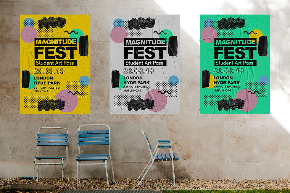
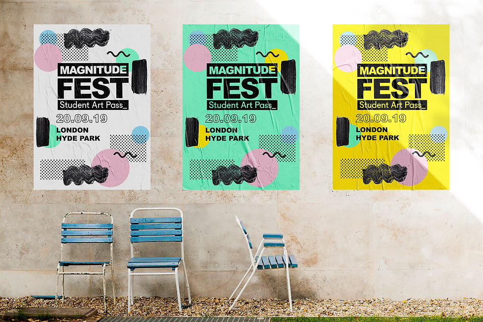
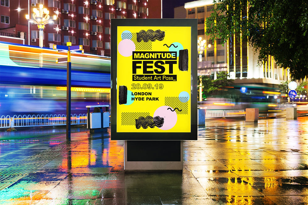
However, going back to the design I found that the strongest colours were either the yellow or the white. These had the better contrast and hook to grab attention.


Taking this information onboard I started to place the posters in situ mockups. I had to adjust elements to accommodate for portrait and landscape. It was during this development that I realised a crucial element of the concept. How was I going to make and advertise this pop-up gallery that was a campaign in itself? It got me thinking about poster placements as well as pop-up locations. I liked the idea of gurrila posters in urbanised areas where there is already interest in art such as locations as: Shorditch, Peckham and Southbank. These locations are key in catching the target audiences attention. It is also paying homage to festival posters that are pasted onto walls. I had the idea of making festival posters with artists and student music producers like headline acts etc. However in the time frame I had left, this idea came to me too late.


Comments