YCN - Art Fund_Exploration & Re-naming
- Megan Pearce Wright

- Mar 20, 2019
- 5 min read
After coming back from the brainstorming session, two names stuck out the most: Art You kidding? and Art You Fest. With these two names I started to do some visual exploration again with font and imagery.


I carried on experimenting with the branding and logo. From being inspired by previous experimentations, and trial and errors. To getting feedback from my peers on the name and logo designs. I still could not decide between the two names and thus put it to a vote on instagram.

When the final votes were counted...
The unanimous vote of 67% over 33%; of 18 - 24 year olds, liked the name Art You Fest. I couldn't argue with the results, as they were my target audience and as such they had the power.
With this knowledge from my findings, I set about experimenting and trialing different logos with the name Art You Fest.
I also began today to try and nail my concept down and what actually happens at the festival and the duration of it. I brain stormed ideas with the girls from our lecture today from 'Girls on Tour'. It was great to get industry feedback from them and with my idea. As we were discussing ideas I made notes and started to think outside of the box. My idea began with this concept of having different rooms like different stages at festivals and having posters with painters and designers on lineup posters like music artists on festival posters. But as we discussed this concept they were saying it would be good to do it outside of London as there are some really great galleries in Leeds and Sheffield. I took this on board and thought about how I could make it link. I thought about University campuses and densely populated student towns.
With this new rename I started experimenting with design style and execution of ideas, this included using elementary design bases, such as shapes and geometric shapes.


From here, I realised the design was missing something. It did not have the connect to art, linking back to what the ArtFund_ did as a brand. I needed to have the link to music but I also needed the link to art. I started to experiment with this as you can see on some of the posters there are paint strokes. I created these strokes by experimenting with physical paint and paint brushes. I used synthetic brushes as well as hog hair. I found the hog hair gave a better texture in the experimentations and the rough style I was going for.


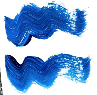


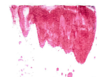
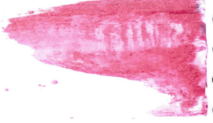


In my experimentation,I did not just use a paint brush I experimented with a t-shirt tag and its mark making. I used heavy body acrylic to create circles in resemblance to CD's and Record Vinyls. I found that on one end there was a cerated edge that created the thin line textures. I had fun closing the laptop lid and playing around with paint. I think this was also a turning point for me. I felt I was going around in circles and hitting a creative block, this exercise was great practise to just experiment and get out of my head, as I felt like I was tying myself in knots and stressing myself out.
I think they worked out well, as I was then able to scan them in and experiment with them further digitally. The black strokes worked the best as it was easier to cut them out in photoshop and to clean them up. I did not want to clean them too much as I wanted to keep it as real to the original scan. As a result of combining digital and traditional elements together I realised I had created a set bank of creative brand elements that can be used in socials and marketing posts.

I then had a set colour palate from the brand in the brief package they sent with the brief. I decided to go with it because I like the pastel colours as its very different to that of my usual colour palate thats high contrast and complementary.

I added in the yellow because it added a pop of colour into the posters and insta-posts. As you can see in my experiments below the yellow works really well with the black.


I liked how the aesthetic of the brand was evolving. You could tell it was relating to the art because of the big circle behind the logo and text.
HOWEVER...
A brief discussion a week before submission date with Derek lead to the realisation of; my idea had evolved linking sound to custom created music. I scrapped the stage concept of different rooms based on stages. But instead, created art rooms. The art resembled a genre and the music would be the variable in each room. With this realisation in mind. The branding needed to link back to this concept of sound. Which lead to the need of RE-NAMING once again.
I went back to the drawing board again, to try and wrack my head around a new name. Me an Derek brainstormed a few ideas but non seemed to click for me. I did some more research into sound waves to try and see if there were any insights I could link back to the name to give it meaning. Lets discard the bottom one on this list as I was getting to the point where I was writing anything I though of to declutter and get the worst ideas out.

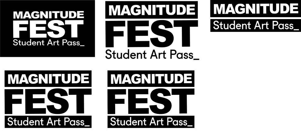
I was looking into sound-waves and mathematical names for sine waves. And then it hit me looking at these graphs the name 'MAGNITUDE' - it sounds like latitude festival and it had a good feel and ring to it. You increase you understanding of art by going to the pop up galleries and you then maximise your culture and opinion on art. As well as the name linking back to the sound element within the design.

With the rename sorted and locked down. I focused on remaking the logo and posters. To refine the logo I printed out different versions onto paper. I then also printed them off in situe of a poster design to see how it worked within the composition. I then used these printouts to get feed back from my friends and class mates. It was nice to close the lid on the laptop again and to see the design for what it was on paper. I was able get a feel of peoples reactions better. Which resulted in me picking the last logo in this series, with two black boxes surrounding 'MAGNITUDE' and 'STUDENT ART PASS_'
In further experimentation towards the poster design, I used a cinema 4d headphone model, too experiment with branding on headphones; reinforcing and visually communicating the link to music in the event and of the art festival. Throughout this experimentation I then realised that the painted circles I had created earlier did not look as strong with the new logo I decided upon. It began to look overworked with too much going on and I realised that the elements were strong enough on their own. I wanted it to be clean and crisp, with sharp contrast with the black to the colour. Complimenting composition with straight and curved lines and dotted texture to create depth.


Now I have my final branding nailed I can focus on transferring it onto other elements of the competition submission. To elaborate and to explain the campaign concept I wanted to create festival wristbands, Posters, Billboards and t-shirts. As well as Spotify and Apple music mockups, to show how students can listen to the music and student artists on display with the famous artwork in the popup gallery.


Comments